ClickUp Dashboard Cards Explained
Video
Dashboard cards turn ClickUp task data into charts a team can read at a glance. How to add a card from the Custom section, build a bar chart on a custom field and a pie chart by status, and choose cards by the question each one answers.
Chapters
Data you can read at a glance
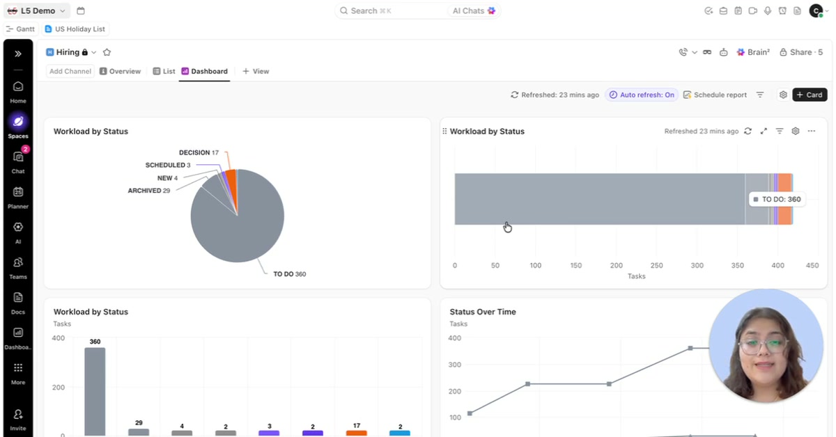
A ClickUp workspace holds a lot of data, and answering simple questions from lists means digging through tasks: how many are overdue, who has the most work, how much is being completed. Dashboard cards answer those questions visually, on one screen.
Building cards from Custom
The + Card button on a dashboard opens the card library, grouped by type. This walkthrough works in the Custom section. It builds a bar chart on a test list, grouped by a custom field called Document type, so each bar shows how many tasks fall in each category. It then builds a pie chart of the same tasks grouped by status, which shows what share of the work sits in each status.
Custom also holds Calculation cards for counts and sums, Portfolio cards for tracking progress across lists and folders, and cards for notes and discussions.
Start with the question
Adding a card because it is available makes a dashboard harder to read. Start from the questions the team needs answered, then choose the card that shows each answer most clearly.